
For me personally, Battletech was an odd choice of game, since I wasn’t a war-gamer but role-player, and yet I have to say over the course of the late 1980s I did have a great deal of fun with this game. In fact, to a point, I owned nearly every supplement that FASA brought out for it, and one that stands out to me is Citytech.
That certainly isn’t to say it revolutionized the Battletech system, but it was a fun piece to take the mech-driven combats from the wastelands of the Successor States to more populated industrial centers. I had my share of fun driving 80 ton behemoths through the streets of cities as I hunted, or was hunted by, mechs from houses like Kurita or Liao.
Still, I think for a boxed set, this supplement falls a bit flat, both from a mechanic perspective and also one of an art fan. So, let me get into what I liked, and what I didn’t, about the artistic experience that is FASA’s Citytech.
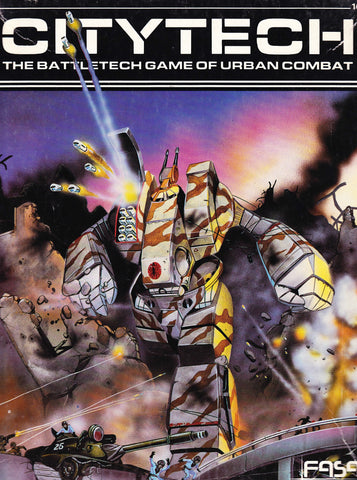
Art directed by Dana Knutson, this rather thin 40 page supplement is rendered in black and white interiors with a full color cover by TSR alumni Jim Holloway.
Now if you’ve read my work at Art of the Genre over on Black Gate then you know I have a bit of a man crush on Holloway’s art. This cover is no different. In my mind, I see Holloway’s work on the Battletech series as a high water mark. That isn’t to say that his skills have degraded since the late 1980s, far from it if you look at some of his more recent work for Pied Piper, but I think something about the setting and the subject matter, or perhaps even his place in life during those years, gave a shine to his pieces that has never been surpassed.
His work on the cover’s rampaging Archer battlemech is stupendous all the way down to the traffic light trailing from the things shoulder. I love the smooth edges of his tanks, I love the action of his fleeing soldiers, which again speaks to his ever-present concept of RPG art reflecting the reality of any situation, no matter how far in the future or mystically fantastic. If nothing else, this supplement gets a three rating just on this cover alone.
The interior leaves much less to be desired, although another heavily compromised [a book credits table is dropped in over half the piece] Holloway image also makes me shake my head in quiet wonder at his skill on the inside of the urban combat rulebook.
Everything after that, however, is done by artist Todd F. Marsh, which I must say is not my favorite style. Marsh did a large portion of the art for Battletech back in those years, and each time I see a piece of his art I cringe. It just isn’t ‘me’, and although it has some merit, I firmly believe that Knutson could have found someone with a better grasp of both anatomy and characterization to foot the bill.
In all, the book only features a handful of images, and all of them inspire nothing more than to move on and try to make a better scene unfold for the game in your mind rather than attempt to reflect what has been laid out for you in black and white.
Artistic Rating: 3 [out of 5]

