

There are a number of reasons to hold Spelljammer as something ‘special’. The primary of these should certainly be the originality of the setting, but for a lover of the history of RPGs, there is something much more fundamentally intriguing about this product to me.
Produced by TSR in 1989 and written by Jeff Grubb, this is what I would consider the final product of TSR’s ‘Golden Era’. Some might argue that moniker belongs to the Forgotten Realms, but that is a bit too early, and Dark Sun a bit too late.
Spelljammer, however, falls perfectly in the wheelhouse of AD&D’s 2nd Edition, and is the last boxed set product to have artwork exclusively by two of the founding members of the 1980s TSR ‘pit’.
Certainly, the work of Jim Holloway, which might be truly classified as freelance by this time, doesn’t take away from the fact that he was still an integral part of that core of artists brought in between 1981 and 1983.
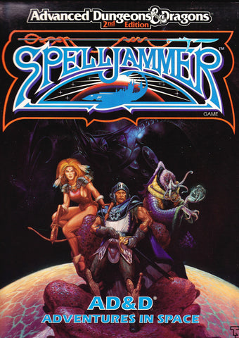
There is also some artistic intrigue in this game because of the addition of Jeff Easley’s seminal piece of cover art. It is the only piece that isn’t done by Holloway, and Jim actually does two booklet covers on the interior that could both have been used for the games cover is so desired by the AD. However, somewhere along the line, I’m convinced that someone at TSR decided against using Holloway as the cover artist and instead had a cover shot recast by Easley who was still working in-house as the final holdover of that old guard.
Whatever the case, this is a stellar [no pun intended] campaign setting that features the same rather comical genius of Holloway set to the backdrop of the unexplored universe. It also contains maps by David ‘Diesel’ LaForce which adds another bit of nostalgic ‘umph’ to the collection.
In all, I love this game, and I love this boxed set, I just wish that Holloway got more credit for the work he put in than he actually did.
Artistic Rating: 4 [out of 5]


I never really saw the point of the sidebar picture on page 59 of Concordance of Arcane Space. She is a nice enough looking character, but I never really got a Spelljammer vibe from this art and thought it was probably recycled.
I much preferred things like the three beholders, on page 83 of CoAS. That fitted in with the concept of the xenophobic space beholders.
I also really loved the pictures that hinted of a crossover between Spelljammer and another setting.
There are some Mezo-American monsters (orcs maybe) getting freaked out by a Dragonfly ship on page 53 of CoAS and an Arabian spellcaster attacking a Naultiloid on page 79 of CoAS.
The true “working art” of the boxed set is the ship cards, with beautiful ship art on one side and functional deck plans on the other side. Sadly, some of the other art doesn’t reach the same standard as these ship cards. There are Hammerships of several different lengths throughout the other art. (My personal handwave is to use those as ship variants.)
Lorebook of the Void is the weaker book of the two, from an art point of view, as it mostly recyclles the art from the ship cards, leaving less space for other art. But there are a few gems. Oddly enough some art that is totally off-topic is put into the monster section. I quite like the Illithid/Nautiloid picture on page 82 (the back of the Krajen) but the picture of the Galleon flying past The Spelljammer on page 68 (the back of the Arcane) is fairly nice. I think that either of those could have been reworked in colour to be the cover of an adventure book.