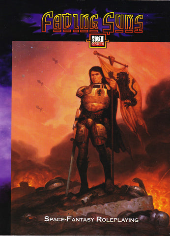

Sometime around the year 2000 I stumbled upon a computer game in the discount bin of a Software Etc [anyone remember those?]. Now normally I don’t go in for science fiction video games, but this one caught my eye because of the box cover. At the time, I didn’t recognize it as a Brom, but nonetheless it was enough for me to shell out the $4.99 for Empire of the Fading Suns.
When I tried to play it, no matter how dedicated I was to learning the mechanics, I just couldn’t find any rhyme or reason to how things worked and finally had to abandon the game completely.
Several years later, at GenCon after the D20 bubble had burst with the implementation of D&D 4E by WotC, I happily went through the discount bins of several retailers looking for heavily discounted D20 games. Once again, I came across that same Brom cover, and once again I shelled out $4.99 for the game, although this time is was the tabletop RPG version, more simply titled Fading Suns.
Now I’ve got a pretty good mastery of D20, so I could have easily played this game if desired, but instead it sat on my gaming shelves and has only been picked up on occasion to peruse the artwork. Therefore, I can’t speak to the solidity of the game itself, but being inside the D20 universe, all the heavy lifting would have been done by WotC, so it should be a nice enough supplement as it goes to 190 pages.
Brought out in 2002 by Holistic Design Inc, this game is based on the works of Bill Bridges and Andrew Greenburg. Written by Bridges and Andy Harmon it is a nice gazetteer of the universe of the Fading Suns.
It was art directed by John Bridges who I can only assume is a brother or cousin go Bill, and I have to say he has done an admirable job.
After reusing the Brom cover, the book itself is filled with interior black and white work by a number of freelancers including John Bridges himself, as well as Mitch Byrd, Christopher Howard, Mark Jackson, Brian LeBlanc, Alex Sheikman, Jason Waltrip, and John Waltrip. Although the Waltrips are the only ones I’ve heard of, the semi-anime style of the interiors does create a nice feel for the space, and Bridges has some cool framing inside both for the full page chapter heading illos as well as some corner graphics that help hold pages.
In all, the Brom cover is stunning, but the capture of it falls a bit flat because the color saturation blurs the image and deprives the viewer with the needed impact that Brom brings to the table. Truly, I’d love to see the original of this piece because I bet it would take my breath away.
Artistic Rating: 3 [out of 5]

